Sorry for the cringy title. I put it down as a placeholder figuring I’d come up with something better by the time I got done writing this. You know what else was hard? Coming up with a project for Kjartan Slettemark! He was edgy and political. As much as I admire his work, political is not something I do here. I want my community to be a safe place to chat, to be silly, to talk about a good/bad/boring/exciting day without any judgement.
On top of that, Kjartan loved his plastic and how do you digitize that? Looking back at Nixon Visions, I could have taken his image and processed it in a bunch of different ways, but in the end it was something else that spoke to me. The Poodle costume.
I love everything about this thing. The best part is that it all came about because of a typo. Six months of work to prove a point against system that dogged the man for years over his mental health all because they couldn’t spell. So good!
Then I came across this image:
That’s when I knew I needed to paint a sexy KjARTan poodle and that’s exactly what happened. One layer, black and white, done in one sitting.
It was so much fun to paint! A little dark, a little weird – it’s the kind of art I love to make. So there you have it, my little homage to Kjartan Slettemark!
The first thing I noticed when researching the life of Kjartan Slettemark is that there aren’t many sources to reference. He was such an interesting artist – how can this be?? We’ll dive as deep as we can in this post, but it’s worth checking out the sources and seeing what else there is. If there’s one thing authors can agree on, it’s that Kjartan lived and breathed his art!
Kjartan’s Early Life
Born in August 6, 1932 in Naustdal, Norway, Kjartan Slettemark was the youngest of four siblings. He pursued a formal arts education, eventually teaching for a time, but he found that Academia didn’t suit him and moved to Sweden in the mid-1960s.
Playing with Plastic
The 1960s marked the rise of plastic. As a material in the daily life of the average person it replaced more expensive materials. For the art world, it was a new medium to explore. In 1964, Kjartan took a course on in plastics engineering. He made many pieces from plastic, including a cake, eggs, and masks. He even cast his own form in plastic and was wrapped in plastic wrap.
Tool for a Hero, Vacuum-packed Collage. 1991.
One of his most famous (and controversial) pieces was a collage made from plastic that protested the Vietnam war.
VIETNAM
In 1965 Norway, Kjartan burst into public view with plastic, politics, and controversy. As part of a project titled “Image of the City”, he created a plastic collage. The composition was an open mouth – inside were the letters VIETNAM, a tiny American flag, and a small figure representing an injured child. With it he included the text, “From a report from Vietnam: Children are showered with burning napalm, their skin is burned into black wounds and they die.” The work was based on a newspaper report that detailed how children were burned to death with napalm.
On Reports from Vietnam, 1965.
The collage was put on display (along with other artists’ works) in front of the Storting, the Parliament of Norway, in Oslo. It was vandalized at least three times by different people, but it wasn’t taken down. The art remained in its display case for the rest of the show with police protection to prevent further vandalism.
More importantly, the attention garnered by the Vietnam collage got people talking about US involvement in the war and debating art as a platform for protest. Some authors highlight how intense the public reaction was to the piece, but it did was good art does – it started the discussion and brought out peoples’ raw feelings. The Vietnam war was already controversial and polarizing. The art gave the public a target for their stance on the issue and a platform to express how they felt.
On Sweden and Being “Borderline”
Kjartan became a Swedish citizen in 1966 after living in Stockholm for 6 years. He was an art teacher for a while, but was fired for refusing to give the students grades (he gave them colorful drawings instead!). As a result, he had to file for social services in 1964. Four years later, he showed up at a social services meeting in an “eccentric outfit” with red and green caps on his teeth. The agency questioned whether Slettemark was simply unemployed or mentally ill. He told them he was an artist that was diagnosed as “borderline” and was prescribed anti-psychotic medication. They tried to commit him, but he refused.
Kjartan’s battles with social services over his mental health was a situation he often explored in his art. He dove into what it meant to be “borderline” and what it meant to be “somewhere between healthy and sick, normal and deviant.”
In 1969, Kjartan put his medication and other items on display in an art show that showcased his mental health struggles. He printed the invitations for the show on welfare application forms. But what truly made this a Kjartan event was that he sent the bill for whole show to social services.
News coverage of the show brought enough public attention to finally bring the situation with social services to an end.
The Passport
Kjartan was staunchly opposed to Richard Nixon and the war on Vietnam. However, after Nixon resigned, Kjartan claimed to feel some sort of connection to him. Kjartan just happened to need to renew his passport, so he took an image of Nixon taken from a 1971 campaign poster and put his own hair and beard on Nixon’s face. He capitalized is name as KjARTan to “sign” the art and submitted it with his passport renewal. The application was processed without incident. He used the passport to travel Europe and to and from the United States several times and was never stopped.
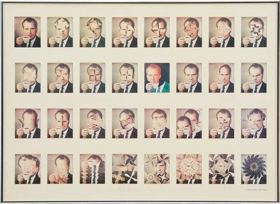
Nixon Visions
Around the same time as the passport, “Nixon Visions” was born from the same Nixon campaign image. Kjartan turned the image into a coffee advertisement and processed the image over and over again throughout the years. One version shows blood running from Nixon’s mouth and cup while another depicts him with a Hitler mustache. Some iterations deconstruct the image, such as one where the eyes are cut out in triangles, switched, and flipped upside down. Another removes the face completely and replace the coffee cup with pieces of the face.
Performance ART
In 1976, Kjartan created his infamous poodle costume. He had once again been summoned by social services, but they mistakenly told him to report to hundmottagningen, which translates to “dog reception”, instead of kundmottagningen, “customer reception”. He spent six months creating the costume, which included built in jackpot sounds and a fluffy codpiece.
At one point Kjartan made passports for his own country of Kjartanistan, producing about 500 of them for anyone that wanted to be a citizen. It was a “non-territorial state with planet Earth as capital city, and himself as prime minister.”
In 2003, he donned a Marilyn Monroe wig and created a Warhol-style collage series titled “Self-Portrait with Marilyn”. He had to give a speech after receiving an award from the Academy of Fine Arts in Stockholm and asked if he could wear the wig, to which they said “Of course!”
Conclusion
This is just a small capture of Kjartan Slettemark’s work. The Poodle was only one of many costumes he wore to blur the lines between life, art, and public discourse. Later in his career he explored his view of the world through video. Nixon Visions continued well into the 2000s. Kjartan was an active artist to the end, stirring the pot until he died on December 13, 2008 of heart failure.
I wasn’t kidding when I said information about KjARTan was sparse. There are some sources that provide additional details about his life, but I don’t include information that I can’t cross-reference with something else. My sources always have more than what I include in my posts, so please give them a click if you want to learn more. And don’t forget about the other artists we’ve covered this year! Thank you for reading!
Kjartan Slettemark was a name I’d never heard until a month ago when I was asked if I would cover a Nordic artist. As soon as I began reading about him I wanted to know more and he’s now our August Artist of the Month!
Information about him is a little light, but he was prolific and controversial. We’ll be talking about plastics, Nixon, ID fraud, wigs, Vietnam, poodle costumes, and drug smuggling – all in the name of freedom of expression. This month’s blog may have to take a slightly different format, but it’s going to be a wild ride!
Tenebrism is one of my favorite art concepts! The only problem is I get a little heavy handed with my shading. So for this month’s project, which centers on tenebrism and chiaroscuro, I wrangled that urge to make every shadow pitch black. (If you missed my last blog, there’s a quick overview of tenebrism vs. chiaroscuro.)
I knew I wanted to paint something in grayscale and overlay the color. That way I could focus on the values and get the contrast just how I wanted it. But what to paint?? I scrolled and scrolled through old projects and sketches and there it was. The Yip Yips.
I don’t even remember why I drew them, but they were already shaded, ready for tenebrist drama. They just needed something to look at. At first I thought I could plunk a candle down and have my single light source and get to work, but it just didn’t feel right. The Yip Yip martians were always trying to figure out some sort of technology like a phone or a radio. The solution? Use technology to figure it out!
Since I was streaming, I used MixItUp to help out. My prompt command pulls an adjective, noun, and verb to give my something to draw, but I also have each one of those broken out into commands of their own. I hit that noun command until it gave me something that could work. Eventually it gave me cake, which made me think of cupcakes, and who doesn’t love a cupcake?? Plus I could plunk a candle in the top and still have the original idea. Sure, it’s not technology, but baking is all chemistry and that’s pretty amazing too!
A few quick adjustments to the sketch and we’re off to the races! Next, I mapped everything out with three gray tones (light, medium, dark) and blended it all together. I wanted some different textures, so the martians were blended with a hair texture brush, the cupcake and table with the regular blender, and the eyes with the blur tool.
This is the part where I changed course. The original plan was to use the Rubens color set and make this a Baroque-style painting, buuuuut… I couldn’t bring myself not to make the Yip Yips pink and blue. So the color set went out the window, but I did use one of the browns for the background!
After overlaying the color, the shadows were a bit washed out. There are a bunch of ways to deal with this, but I took the quick and dirty option. I used the airbrush tool and (gently!) swiped black over the darkest areas and it picked up those spots that really needed to be dark shadows.
Now that it’s all balanced out better, we can call it done! Sort of? Sorry, but for me it’s just not dark enough! It’s chiaroscuro, but not tenebrism. For the sake of this article, and my heart’s desire for blackness, I corrected the contrast on the exported file.
Aaaaah, that’s better! And it still doesn’t go as dark as half my other stuff! I was 100% determined to do this in one sitting – and I did. It took six hours and I could spend another six picking at all the things my brain can’t unsee. But I think it was a good exercise in contrast and I’m pretty happy with it – yip yip yip yip yip yip yip yip uuuuuh huh!
For the last two months I’ve been talking about Baroque art this and Baroque art that, but what is it really? This little blurb sums it up better than I could in an entire blog post:
“The Baroque artists were particularly focused on natural forms, spaces, colors, lights, and the relationship between the observer and the literary or portrait subject in order to produce a strong, if muted, emotional experience.”
Essentially we’re looking at drama. We’re looking at using tension in the forms and lighting to draw the viewer into the scene being depicted. Different regions had their own spins on the concept. Last month I wrote about Peter Paul Rubens, another Baroque artist from Antwerp. If you put his work side by side with Artemisia Gentileschi’s you’ll see that they had very different technical approaches to their subjects, but both fall into the definition of Baroque art.
Peter Paul Rubens. Judith with the Head of Holofernes. ca. 1616
Artemisia Gentileschi. Judith and her Maidservant. ca. 1623.
OH the DRAMA… er… Contrast
Ever since I learned the terms chiaroscuro and tenebrism, I’ve used them interchangeably. I think I was even taught that they were the same thing. In researching this post I learned that they in fact are not the same thing – similar, but different. What I’ve noticed is that chiaroscuro tends to be used more when talking about Italian artists, probably because it’s an Italian word, and tenebrism tends to be used more elsewhere. That or my brain is messing with me because I’ve been doing it wrong for a loooong time…
So what’s the difference?
Chiaroscuro literally comes from the Italian words for light and dark. When you see a brightly lit subject against a dark background, that’s chiaroscuro. Tenebrism is a type of chiaroscuro. This article describes the difference as being in the shadows. Tenebrism takes the dark areas to full black and creates a sort of spotlight effect. The article goes further:
“If chiaroscuro is about the relationship between light and shadow, then tenebrism is about the shadow itself.”
Beautifully said. Chiaroscuro is a core element of Italian Baroque art and mastering it is a sure-fire way to get more depth and drama into your art. Personally I fall way too hard into tenebrism when I shade, but I’m doing better! I swear!
Where’s the Art??
Let’s look at some paintings! We’re going to explore Artemisia Gentileschi’s work by comparing it to her contemporaries. Her treatment of various popular subjects was very different than that of her male counterparts. You will often find art historians comparing her pieces to those of Caravaggio – perhaps one of her greatest influences after her father.
Even without these comparisons, her art still stands out. She had a perspective that no other artist of her time could have and the level of her craftsmanship rivaled that of her peers. With that, let’s dive into her first known painting – Susanna and the Elders.
Susanna and the Elders, 1610
The Susanna and the Elders story is from chapter 13 of the book of Daniel. She was the beautiful wife of Jo’akim, a wealthy man from Babylon. He was the most honored in his community and frequently entertained visitors. This included two elders that were recently appointed as judges.
Every day at noon, when everyone had left, Susanna would walk the gardens outside her home. On a particularly hot day, she wanted to bathe in the garden, sending her two maids to fetch her oil and ointments and ordering them to shut the door behind them.
They didn’t see the two elders hiding. The men had grown to lust after Susanna and were lying in wait for the chance to seduce her. As soon as she was alone, they ran to her and professed their “love”. They told her that if she did not lay with them, they would tell everyone that she sent her maids away so she could lay with another man.
Artemisia Gentileschi. Susanna and the Elders. 1610
This is the moment captured here: the two elders leering over the young woman as she resists their advances. Artemisia depicts her twisting away from them, a look of fear and distress on her face as they conspire behind her. The figures of the two men form a single heavy presence hanging above Susanna, making them all the more threatening and oppressive. The three figures form an inverted pyramid, expressing the power they hold over their victim in that moment.
The men are dark and shadowy, while light shines upon Susanna. Not only does this illustrate their ill intentions against her, it highlights Susanna as a virtuous woman who did not give to them. I also believe the light on Susanna foreshadows the favor she received from God later in the story. Despite being arrested as a result of the elders’ false accusations and sentenced to death, her prayers for salvation were answered when Daniel proved her innocence.
Cagnacci vs. Gentileschi
Now let’s compare it to Guido Cagnacci’s version. He was another Baroque painter that lived right around the same time as Artemisia Gentileschi.
Guido Cagnacci. Susanna and the Elders. ca. Second Half of 17th Century
Artemisia Gentileschi. Susanna and the Elders. 1610
In Cagnacci’s version, Susanna is on the same level as the Elders. She leans slightly away from them slightly, but her face is calm and she’s making eye contact. This is hardly the reaction a woman would have when being interrupted by two old men in the middle of her bath. We see the same shadowy figures contrasting against the light on Susanna, but the composition and her pose suggest she is the one seducing them. Any indication of her virtue, such as her crossed legs, seems like an afterthought. Her presence and her beauty appear to be more for the consumption of the viewer than a realistic portrayal of Susanna’s plight.
If you look at other versions of this scene, you’ll see varying degrees of resistance (or lack thereof) from Susanna. You’ll also see varying degrees of menace from the elders. In a few paintings they even look kind of… nice.
If there was one thing Artemisia Gentileschi could do it was to capture a moment. Not just any moment, but one of raw emotion and tension. In Judith Beheading Holofernes, she captured every ounce of anger and vengeance when she portrayed Judith sawing off the head General Holofernes.
The story goes that Holofernes was an Assyrian General sent by the king to besiege the city of Bethulia where the beautiful widow Judith lived. She prayed to God and decided to kill the General herself. Judith put on her finest clothes and went to the enemy camp with her maidservant. She seduced the General and got him drunk. Once he passed out, she cut off his head with his own sword.
Artemisia Gentileschi. Judith Slaying Holofernes. ca. 1614
The scene is brutal. The maidservant holds down Holofernes as Judith grips him by the hair and saws into his neck. Blood drips down the bed. The women wear expressions of anger and determination while the general’s face is frozen in fear and panic.
This composition is lit by a single light source outside of the scene, the lights and darks adding even more tension and drama to the act itself. The pure darkness of the background adds an element of the unknown and contains the focus of the viewer to that of the women – to kill the general.
Now I really didn’t want to do this because everyone does it, but it’s such a good comparison that we pretty much have to look at Artemisia’s version next to Caravaggio’s. After all, he is one of the best known Baroque painters. This really takes me back to the good ol’ college days looking at slides of this exact thing…
Caravaggio vs. Gentileschi
Caravaggio. Judith Beheading Holofernes. ca. 1599
Artemisia Gentileschi. Judith Slaying Holofernes. ca. 1614
In Caravaggio’s version we have the same beautiful chiaroscuro, a great moment of tension, and a gruesome portrayal of Holofernes’ death. What’s different is Judith. Sure, she has a handful of hair to hold the General’s head while she cuts it off and the tension in her hand as she grips the sword is beautifully rendered. But look at how far back she’s standing and the uncertainty in her expression. This is not the look of a woman that’s there to murder someone in the night.
The maidservant is elderly and looks on as she hold the bag to carry the General’s head – a far cry from Artemisia’s version where the maidservant is actively involved. It’s almost as if the artists are expressing two different views on what a woman is capable of. In these moments it can be hard not to place a modern feminist perspective on viewpoints from centuries ago, but it’s just as difficult to deny that Artemisia had something to say about what women can do.
This is one of my all-time favorite paintings. I love everything about a single light source painting and anyone that’s been in one of my streams and witnessed my struggle with making things way too dark totally gets why I love this piece. This is what tenebrism is all about.
We’re at the next part of the Judith and Holofernes story where Judith and her maidservant are about to escape the camp and return to Bethulia. They have the bag full of severed head and are peering into the darkness, presumably to see if anyone is coming. Judith still holds the sword she used to kill Holofernes while her maidservant secures the head.
Artemisia Gentileschi. Judith and her Maidservant. ca. 1623.
This is an example of a composition using tenebrism rather than chiaroscuro. The blackness that surrounds them alludes to the unknown and the potential danger as they complete their missions. Strangely they have no blood on their clothes, but this is true for all of the depictions of this tale at the time. Perhaps it was an aesthetic choice or some sense of propriety (weird since we’re talking about two women that just cut a guy’s head off), but maybe the red drapery here is an allusion to the bloodshed.
Gentileschi vs. Gentileschi
But what about her father’s version? How does Orazio’s Judith compare?
Orazio Gentileschi. Judith and Her Maidservant with the Head of Holofernes. ca. 1621
Artemisia Gentileschi. Judith and her Maidservant. ca. 1623.
Orazio’s version seems to show more confusion than determination in the expressions of the women. The way they huddle suggests fear. In Artemisia’s Judith, one is on the lookout while the other secures the head. She also added more tension with her single light source where Orazio’s composition includes ambient light that fully illuminates the figures. They still don’t have blood on their clothes, but in this one Judith is wearing red. Maybe it represents the blood and aggression here too?
Finally, Orazio’s composition has the women forming a pyramid. There’s no space to breathe between them and maybe he chose to do that to create that moment of tension. But Artemisia chose to split them up, with one standing and one crouching. This creates a more dynamic interaction between the figures, the scene, and the viewer.
Phew! This was a long one, wasn’t it? Thanks for going on this journey with me. Artemisia Gentileschi truly is one of my favorite artists! I could have gone on for longer, but I want to know what you think. How do you interpret these paintings? What other differences do you see?
Most of all, I want to know what artist you want to see next! Let me know in the comments below or holler at me on Twitter!
If it ain’t Baroque, don’t fix it. Hehe, I had to.
I’m talking thicc boat this month, people. We’re exploring the life and art of none other than Peter Paul Rubens. Maybe you know his art for his Rubenesque women or maybe even the drama-filled Marie de Medici cycle. Did you know he was also a successful diplomat that spoke several languages and painted for some of the most powerful people of his time?
Word on the street is he was really handsome too.
We’ll also dig up what we can about how he painted. For all the times we’ve talked about the techniques of the old master, we’ve never discussed what that actually is! Rubens was certainly well acquainted with these techniques and ran his own studio full of students and assistants.
Marie de Medici’s attitude is the reason her own set of paintings was never completed. 1622.
For the project, we pretty much have to draw some Rubenesque women. What I haven’t figured out yet is what kind of spin to put on it. Should we go nerd? Try adding some allegory? Would traditional painting techniques work in digital? What do you think? Let me know in the comments below!
The May Artist of the Month is Tamara de Lempicka – a Polish artist that painted in the Art Deco style. I don’t know much about her or Art Deco, but I feel like I’ve seen her work before. After a few quick reads it was clear that she led a fascinating life that I think will be fun to explore.
She married at 16, rescued her imprisoned husband during the Russian Revolution, and fled to Paris. They eventually moved to the United States where she painted portraits of celebrities. De Lempicka retired to Mexico where she died, her ashes scattered across a volcano.
Have you been wondering when we’ll talk about an artist that’s still alive? Then April is your month! We’ll be taking a look at the life and art of Bridget Riley. She was a prominent artist in the Op Art movement of the 1960s, first exploring geometric patterns in black and white and then moving to color combinations to influence the eye.
Riley’s work spans seven decades, so there’s plenty to explore. For the project this month, I’ll be playing with patterns and colors to see what kind of fun effects emerge. Let’s get ready to take our eyes on a wild ride through Op Art!
Originally I was going to write about Francisco Goya for the March Artist of the Month, but there was one problem (at least to me). We’ve spent the last two months in the late 19th and early 20th century and Goya’s work is only slightly earlier than that. We need to break at least a few centuries away!
Francisco de Goya, Saturno devorando a su hijo (1819-1823)
The idea for who to write about instead jumped out at me so fast I pretty much HAVE to do it! It’s Michelangelo! I know, I said I was going to choose artists that weren’t “too well-known” and I’m going back on that. There are more resources than most people will ever need on Michelangelo. But rather than focus on the artist himself, I want to focus on his process and why his (and other artists’) work looks the way it does.
And then there is the March project. This time it was an easy choice. We’re going to choose a reference photo of a man and sketch it three times – once as a man, once as a woman, and once as nonbinary. Then I’m going to do the same with a reference photo of a woman. The idea is to explore the way gender is translated based on the original reference versus the intended result.
Oh my, that sounded kind of dry, didn’t it? Here’s a better description – I’m going to sketch a bunch of nekkid people because it’s educational on a whole bunch of levels and it’s still something talk about even if you just show up for the nekkid drawings.
That particular stream will most likely be on YouTube since there’s no point in trying to do this type of stream on Twitch. See you there!
P.S. We will definitely be revisiting Goya in the future. 🙂
Expressionism began around 1905 in Germany and Austria. Recognizable by its bright, artificial color palettes and simplified forms, it introduced distortions of reality designed to elicit an emotional reaction from the viewer while simultaneously taking inspiration from and rejecting art movements of the past.
German Expressionism was a response to two things. First, there was the prevalence of Impressionism. While the style was modern, it was still representational in both the color palette used and the subjects rendered. Expressionism thus became a sort of Anti-Impressionism in that it placed substance over style.
Second, the rapid urbanization occurring around the world coupled with a series of international events that lead to Word War I added an undertone of anxiety and looming danger. It became more apparent as the outbreak of war approached and the world anticipated the impact of global conflict.
Over time many Expressionist artists incorporated other styles into their work. They experimented with Cubism, Dadaism, and more as Expressionism was more about evoking a raw emotion than anything else.
Franz Marc’s Early Life
Franz Marc was born in Munich on February 8, 1880. His father was an amateur landscape painter. Although he received instruction from him, Marc didn’t pursue art as a career until after completing military service. He enrolled in the Munich Academy of Art in 1900, but the focus placed on natural realism there didn’t suit him.
Portrait of the Artists’ Mother, Franz Marc, 1902
In 1903, he studied in Paris for six months, returning in 1907 to see the art of one of his favorite contemporaries, Vincent Van Gogh. He made several trips to Paris during those years where he took inspiration from some of the biggest artists of the time. He also gained an appreciation for Matisse while he lived in Munich.
Marc loved nature. He suffered greatly from depression and nature had a calming effect for him. When he lived in Berlin he studied animal anatomy extensively and made money by offering anatomy lessons to other artists. It is said that he “spent countless hours studying and sketching animals from every conceivable angle.”
In 1910 Marc had his first solo show in Munich. That same year he met August Macke and Wassily Kandinsky and they formed the group known as Der Blaue Reiter (The Blue Rider).
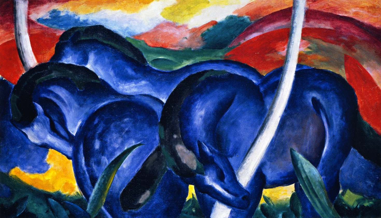
Large Blue Horses, Franz Marc, 1911
Der Blaue Reiter
When Franz Marc, Wassily Kandinsky, and August Macke formed Der Blaue Reiter, they were “united by an interest in exploring spirituality and a belief that art is more than meets the eye.” Individual colors had meaning and forms were simplified. Most importantly, the group shared a common philosophy that artists should be free to express their ideas as they saw fit.
Indeed they had a lot to contend with as global events escalated. It contributed to their apocalyptic view of “the toxic state of the world.” Marc himself believed that war would bring about a cleansing of the natural world.
Style and Subject Matter
Influence of Other Styles
Early on Franz Marc experimented with Naturalism and Realism due to his academic background. But in order to break free of the confines of realism, he also played with styles such as Impressionism, Pointillism, Fauvism, and Cubism. It was Fauvism that perhaps had the greatest influence in those early years as he combined the “intense, symbolic color palette of the Fauves” with his interest in anatomy.
The Red Horses, Franz Marc, 1911
Color Theory
As Marc’s palette became more intense, he developed his own color theory that added meaning to his work. Blue was a masculine color, “astringent and spiritual.” Yellow was a feminine color, “gentle, happy, and sensual.” Red represented the physical world, which was at times violent and dangerous. Marc said himself, “Red is matter, brutal and heavy and always the color to be opposed and overcome by the other two.”
Animals
Complementing Marc’s color theory was the way he perceived and represented animals. He considered them the ideal subject – “pure, truthful, and beautiful” – unlike people that rarely featured in his work. To him, animals represented what the modern world was missing and “animals in a landscape were… a bridge between man and nature.” They were spiritual, innocent creatures that brought him a sense of peace.
Tiger, Franz Marc, 1912
Late Work
In 1912 Franz Marc met Cubist artist Robert Delaunay, whose work greatly influenced his. It was around this time that Marc’s work took on a more Cubist flavor, evident in paintings such as Tiger. Marc’s work also became darker and more apocalyptic and his view on animals changed. These once pure creatures in his eyes were now “as impure as human beings.” By the time World War I broke out in 1914, his work became completely abstract, thus completing his transition away from realistic representation.
The Tower of Blue Horses, Franz Marc, 1913
Fate of the Animals, Franz Marc, 1913
World War I
Marc immediately enlisted in the German army when WWI broke out in 1914. The German government attempted to remove notable artists from combat, but for Marc they were too late. He died in the Battle of Verdun from shell splinter to the head in 1916.
During World War II, Hitler classified Marc’s work as “degenerate” and attempted to censor it. Most of his work survived the war and can be enjoyed in museums around the world.